Back in the day, an elementary school teacher chose to chastise us students on the poor quality of our handwriting. Pointing to the alphabet displayed over the blackboard, she said, “Look at those letters! Look how perfect they are! Do you think they were drawn by a machine? They weren’t. A person wrote those.”
Which simultaneously shamed and puzzled youthful Joe. The green-and-white sheets of cardboard were clearly printed by a machine. Beyond that, some part of me must have received her meaning. A human being had shaped those letters, even the weird Q that looked like an overwrought numeral two.
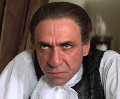
 |
| Timothy Matlack, Master Penman courtesy Wikipedia |
Five-plus decades later, I blame her tirade for my lifelong obsession with fountain pens, stationery, calligraphy videos, and a late-life interest in books about how adults can improve their penmanship.
Which leads us inevitably to the summer of 1776.
One of the enduring factoids about the origin of the United States is that we’ve gotten our national birthday wrong. (That is so you, America!)
Citizens here embrace the Fourth of July as a holiday, when in fact July 2nd was the day of the vote that severed the colonies from the Crown. July 3rd was spent quibbling over the document Thomas Jefferson had spent 17 days drafting in his boarding house on Seventh and Market streets in Philadelphia. Finally, on July 4th, Congress accepted, or adopted, the language of the Declaration of Independence.

Congressional printer John Dunlap was authorized to print broadsides for the general public of the (now former) colonies. Only 26 copies of these are known to exist today. In 1989, a man perusing a flea market bought an ugly $4 framed picture and discovered an original Dunlap tucked inside. It sold in 2000 during a live Sotheby’s internet auction for $8.14 million to the late television producer Norman Lear.

Yet those broadsides are not the document Americans carry in their collective memories. The document preserved behind bulletproof glass at the National Archives is known as the engrossed Declaration. That’s the word used in the 18th century for an official handwritten legal document.
The man whom historians consider most likely to have put quill to parchment to create this piece of calligraphic history was named Timothy Matlack.

He was a political radical, a brewer, and the founder of the Society for Free Quakers, an organization for like-minded individuals who had been booted by the Friends for the bellicose stance they took during the Revolutionary War. After two Quakers criticized his sons for taking up arms in the conflict, Matlack had them caned. People openly mocked Matlack for wearing a sword around town, which was admittedly weird in an era of flintlocks.

A clerk in the Pennsylvania State House, Matlack was known for his lovely penmanship. He had engrossed the papers commissioning George Washington as general of the Continental Army.
For the Declaration, Matlack picked out a piece of parchment that was close to a square. He might have used a pin to mark off his margins and a straight edge to keep his lines straight, though the document bears no evidence of those standard techniques. His quill would have been dipped in handmade, iron gall ink.
The document contains only 1,337 words, excluding the signatures. So far as I know, Matlack only made two errors, spelling the word “Representative” wrong in the fifth grievance, and omitting the word “only” in a later sentence. Jefferson may have inserted the corrections careful readers will find in the document.

Members began affixing their signatures to the engrossed parchment on August 2, 1776. (The last signer may have signed as late as 1781. Col. Thomas McKean of Delaware was off fighting the war.)
Americans who grow up seeing reproductions of this document often don’t realize that it is handwritten; Matlack’s lettering looks too consistent and too florid to be “real.” The heading—“The unanimous Declaration of the thirteen united States of America”—resembles a classic black letter, or “Gothic,” font, and reappears in four other spots in the text. The rest of the document is written in what we can only assume is Matlack’s standard fancy hand.
 |
| Brian Willson |
Which brings us to 2003, when a gentleman named Brian Willson tracked down a copy of the Declaration he’d acquired as a kid, on replica parchment, and began studying it intently.
By then, Mr. Willson had become one of the world’s leading typeface designers. Since 1993, he has created an impressive library of fonts, often culled from handwritten documents. He has, for example, created typefaces based on the handwriting of Abigail Adams, John Paul Jones, Stephen F. Austin, Frederick Douglass, Sam Houston, and John Quincy Adams, just to mention a few. He created one, dubbed Professor, that mimicked the handwriting of his father, who was a professor of Germanic languages. And once, after spotting the hasty scrawl of a handwritten diner menu in Maine, where he lives, he produced Oak Street, the “messy-looking” typeface of his dreams. (You can inspect all of these at his main web site: 3IP Type Foundry.)
It’s impossible to overstate how important typefaces are to the modern world of design. One of Mr. Willson’s fonts was used to represent the handwriting of Severus Snape in the potions book shown in the movie
Harry Potter and the Half-Blood Prince. His work has appeared on the cover of a book by Nicholas Sparks, the design of The Spiderwick Chronicles book franchise, the cover of an album by the Dave Matthews Band, and a Ken Burns parody shown on the Jimmy Kimmel Show. My personal favorite was the appearance of one of his text fonts in a throwaway-but-critical scene in the comedy series, Arrested Development. Another interviewer dubbed Mr. Willson’s work “crazy famous,” and I’m inclined to agree.Acting on a hunch that Matlack’s hand would prove popular with designers, Mr. Wilsson spent a “tedious” six months transforming Matlack’s handwriting into 608 characters. It’s not enough for a type designer to replicate the look of the letters that appear in their primary source. They must also extrapolate from the primary source. How would Matlack, in others words, have written a dollar sign ($), the at symbol (@), or the trademark symbol (™)? His process, Mr. Willson says, went like this:
- Pore over the old scripts, looking for the most typical and legible letters of the upper- and lowercase alphabets, along with numerals, punctuation marks, etc.
- Scan each of these glyphs and bring the saved digital scans into a program with vector graphics tools (usually Adobe Photoshop), then begin tracing.
- Export the traced outlines as PostScript files that can be imported into a font design application (Fontographer or FontLab), where each glyph can be tweaked, perfected, and (in the case of cursive scripts) made to seamlessly connect with every other.
The result is a font which Mr. Willson dubs American Scribe. (Naturally, that is the font I'm using to illustrate this post.)
“Matlack did indeed have lovely, legible penmanship,” says Mr. Willson. “Whereas I don’t recall thinking things like, ‘Oh, he must’ve dipped his pen here,’ it’s always gives me pause to see the occasional ink blot or inserted word (as “only” inserted by Jefferson in the Declaration) or cross-out or underscore in some of these old documents.”
The font set he created actually replicates those ink blots…

I asked him what it’s like to trace the words of a long-dead person and then presume to write like them. “In all the old pen fonts I’ve designed,” he says, “I feel like I’m somehow ‘inside the head’ of the writer whose script I’m replicating. You can seemingly get a feel for the emotions based on pen pressure (or lack thereof) and the like. There’s something extra there, too– as when you recognize the handwriting of a beloved family member in the address on an envelope you might receive in the mail (or used to receive, as handwritten letters aren’t anywhere near as common as they used to be).”
Now, you might well ask who buys such a product, and how do they use them? The most logical clientele are designers who work at historical sites associated with the Revolution, such as Colonial Williamsburg, who need reliable fonts to create a library of replica documents. Mr. Willson hears from users and fans often.
“It’s one of the finest rewards of this work,” he says. “And, yes, some folks likely wish to give the feel of the Revolution in their use of American Scribe, but others simply like the look of the font and their use is entirely unrelated (as when it appears on wine labels, say).”
I take perverse glee knowing that someone took so much time to remember Matlack’s work. The great irony, of course, is that his original parchment is so badly faded at this point in history that we must all rely on the 1823 Stone engraving to see what the Declaration looked like during its first century. The U.S. Constitution, written just 11 years later, is in much better shape. Both repose in darkness in the rotunda in Washington, DC.
Visitors who want a peek must press a button, which illuminates the documents for a little while. All day long, as tourists traipse through, the sacred principles of a nascent nation wink on and off, as if saying, We’re still here. We’re still here. We’re still here…
- My full interview with Mr. Wilsson lives here.
- Investigate American Scribe and his other fonts at OldFonts.com and 3IP Type Foundry.
- His novel, about a typeface designer who acquires a haunted house in Maine…
- A documentary recommended by Mr. Willson:
See you in three weeks!
— Joe


.jpg)