A few weeks ago a new writer member of the Short Mystery Fiction Society asked for advice on craft and best practices. I referred the writer to SleuthSayer and received a quick thank you.
Got me thinking so I thought I'd share my earlier comments about covers (and a few new comments about covers).
My original SleuthSayers post started with advice from Harlan Ellison and other writers who felt a book cover should have one strong image, the writer's name and maybe one thing about the book – it's a novel or a mystery novel or a thriller, etc. Maybe a notation about awards the book received such as Edgar Award or Shamus Award. Maybe a note about writing awards the writer received but don't clutter up the cover with a list. That's why there is a back cover.
Covers should be clear when viewed as a thumbnail since our books are viewed more online than in a bookstore. A cluttered cover or one which does not clearly give title and author's name can be confusing.
A tip I included was this and it worked. I received a couple emails commenting how it worked –
TIP: If you do not have the ability to design a cover using Adobe InDesign or Photoshop, get the image you want on your cover and go to the nearest university's art department. Seek out a college student majoring in graphic design and hire the student to design your cover. They can add your cover to their portfolio and you can cut a bargain with them.
I was going to put examples of good covers but the writers I contacted have not gotten back to me. I was also going to put examples of bad covers but, hell, I don't like to do things like that. You can use your imagination and I don't have to make anyone angry or feel like I'm putting them down because who the hell am I anyway.
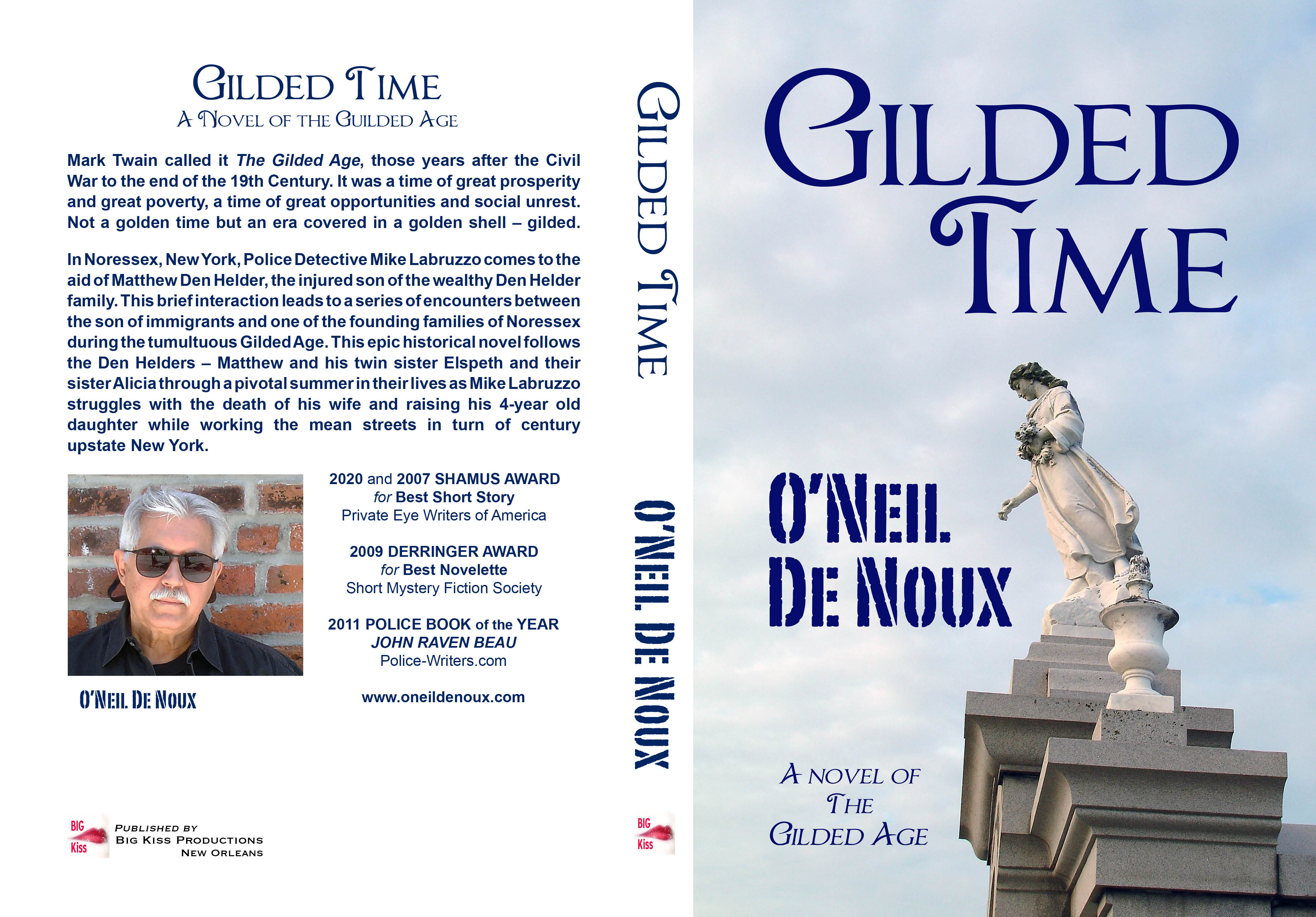
As an Indie writer I am able to control the covers of my books and spell my name correctly. As you can see, it's nice to have an artist in the family. As previously mentioned, the covers of my early books were pretty bad.
Here are a few of my recent ones:


Nothing's perfect but all you can do is try.
www.oneildenoux.com

They look good to me,
ReplyDeleteI like these covers, O'Neil. One of the advantages of self-publishing is that you can tell a cover designer exactly what you want and bounce ideas off each other...or design it yourself. I had a cover designer who worked with me in several capacities in theater--acting together, designing sound together, acting in shows I directed, and designing many posters for plays I directed, so we figured out how to communicate well. I loved the covers he came up with, often after several weeks of back-and-forth discussion.
ReplyDeleteTraditionally published books often have covers that do nothing for me. Most of them, I wonder if the designer read the MS or even talked with anyone else who had. There are a few generic covers I see over and over: the urban skyline (or the pastoral landscape), the damsel in distress, a smoking gun (or bloody knife). Once in a while someone presents a strong and appropriate graphic image, but it's rare.
They look great! And I love the title "The Spy Who Used My Love".
ReplyDeleteI've always liked your covers, O'Neil. Well done!
ReplyDeleteYes, I bet it IS good to have an artist in the family. She does a great job.